

If you find yourself with a slightly different design from the Google login page from 14 June onwards, don’t worry, as this is an official change that the company will start to make from that date, with a gradual deployment of up to 15 days to try to reach all its users, both end users and business users of G Suite.
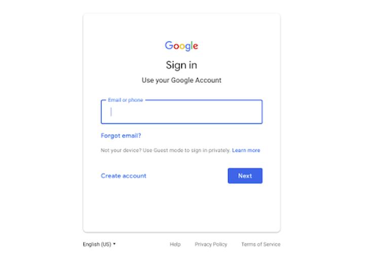
The company has already advanced that the new redesign will include adjustments to the Google logo, a blue outline around the text field and the central alignment of all on-screen elements.
Note that at the level of functionality virtually nothing changes, where each user will have to continue to provide their email address and go to a second screen to provide the password for their own account, a practice that is also being adopted by other Internet services: that of splitting the login into two different parts.
Google just wants to make the home page more attractive in the same way that it is continually redesigning the web aesthetics of all its services so that they can offer an improved, elegant and modern look, and not become outdated with the passage of time.
In this sense, Google will apply its well-known visual style Material Design to adapt the web aesthetics of its login page, a redesign that comes three years after the redesign we are still enjoying.