

A series of changes have been announced by the Microsoft team that is reflected in the new Skype design to make it easier to use. This is taking a step backward in the design they presented last year to improve the user experience.
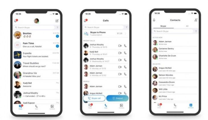
That is because users have expressed that it offers too many options, making the dynamics a complicated and confusing experience. And in their return to simplicity, they will focus on the most popular features: Calls, chats, and contacts.
The three options are those that appear in the foreground of the app, eliminating capture and the famous highlights that didn’t have the expected reception. The highlights will finally disappear on September 30th.
Also the desktop version follows the same dynamics, whereby these three options have priority and the organization of the previous design is adopted with the contact bar on the left side. They have paid special attention to all those details that are detrimental to minimalist style and that are not absolutely necessary for the user.
On the other hand, there are new light and dark themes, and the classic blue color of Skype is back. As mentioned by Skype’s Design Director, this is just the beginning of a series of updates that come in response to user requests.